Ottawa Pride Hockey
Logo and motion assets for first annual Queer Capital Cup.
BRANDING
MOTION
ILLUSTRATION
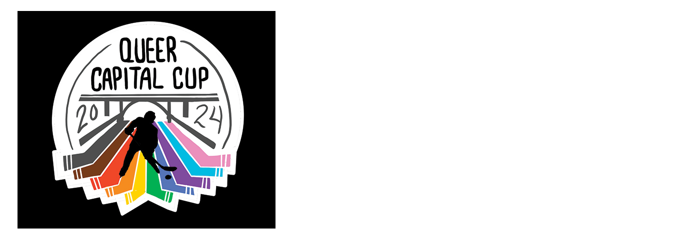
2024-2025 • For the inaugural Queer Capital Cup (QCC), the Ottawa Otters needed a new graphic to promote their tournament. After the logo was chosen, the project grew to include a fully branded social media package and motion assets, to really elevate the online experience leading up to, and during, the tournament weekend.
Client:
Role:
Graphic Design | Motion Design | Illustration
Favourite Detail:
Seeing the logo on merch during the event. Getting to work for the Otters team was such a delight personally and professionally!
Inspiration
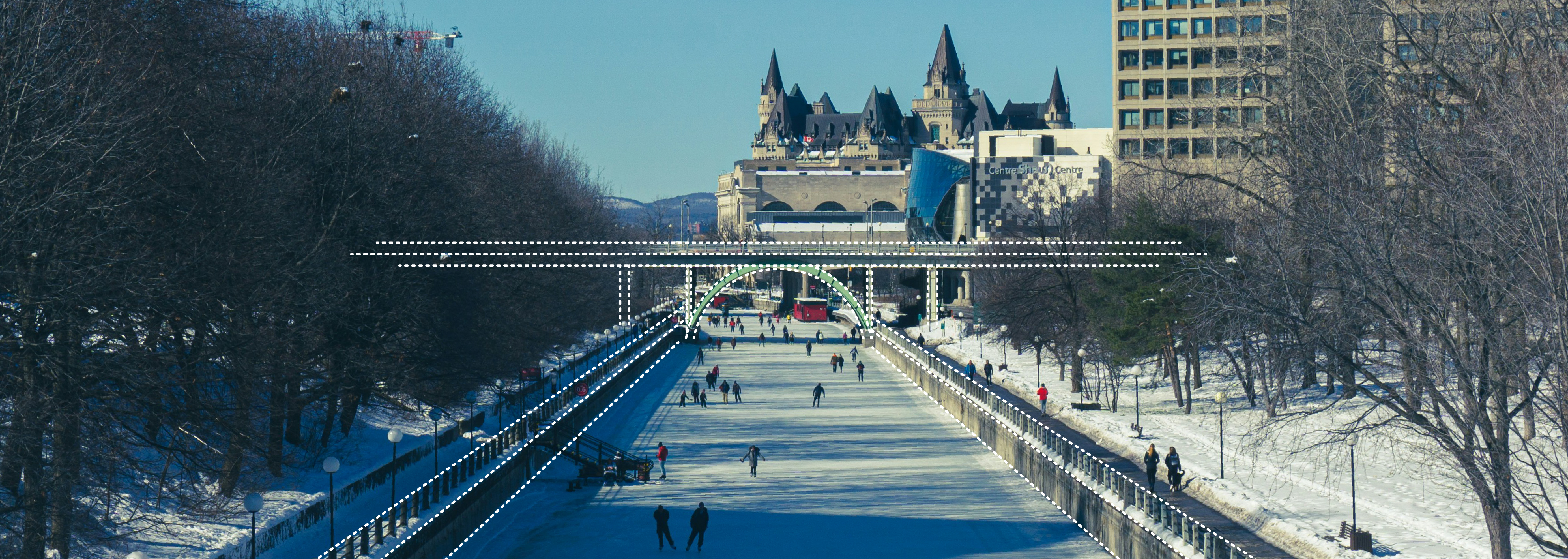
The Otters team wanted a logo that clearly represented Ottawa, but wasn't just generic imagery of the Parliament buildings. When considering alternate options, the iconic Rideau Canal seemed a great option to represent the city, while also making the connection to ice skating. A distant view of the Laurier Avenue Bridge makes up the main shape of the graphic.
Components
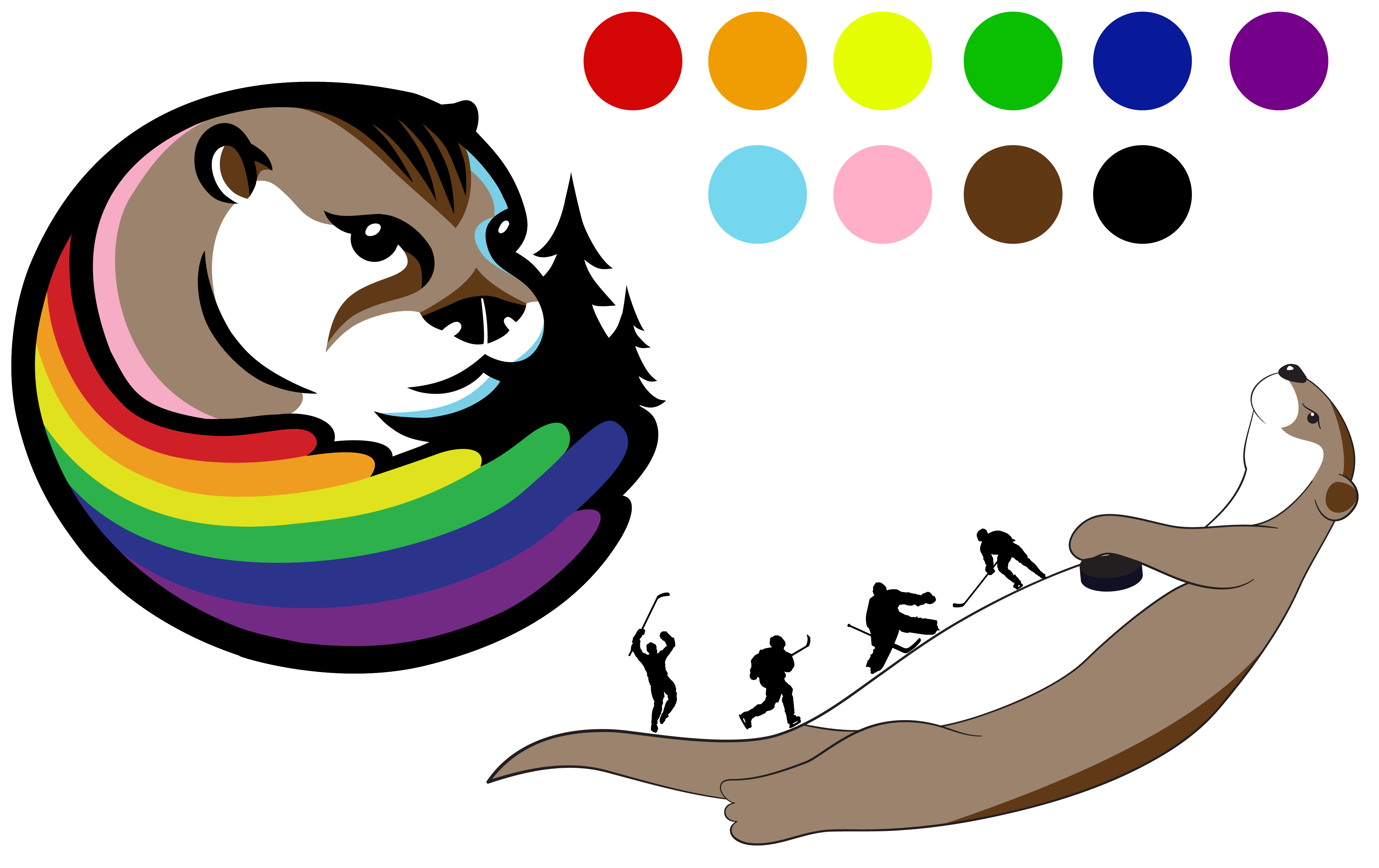
The Otters have a great logo established, and I used the same colouring in the tournament logo to stay within their established brand style. I reproduced versions of the logo otter and this other existing otter image for my new illustrations and motion pieces.
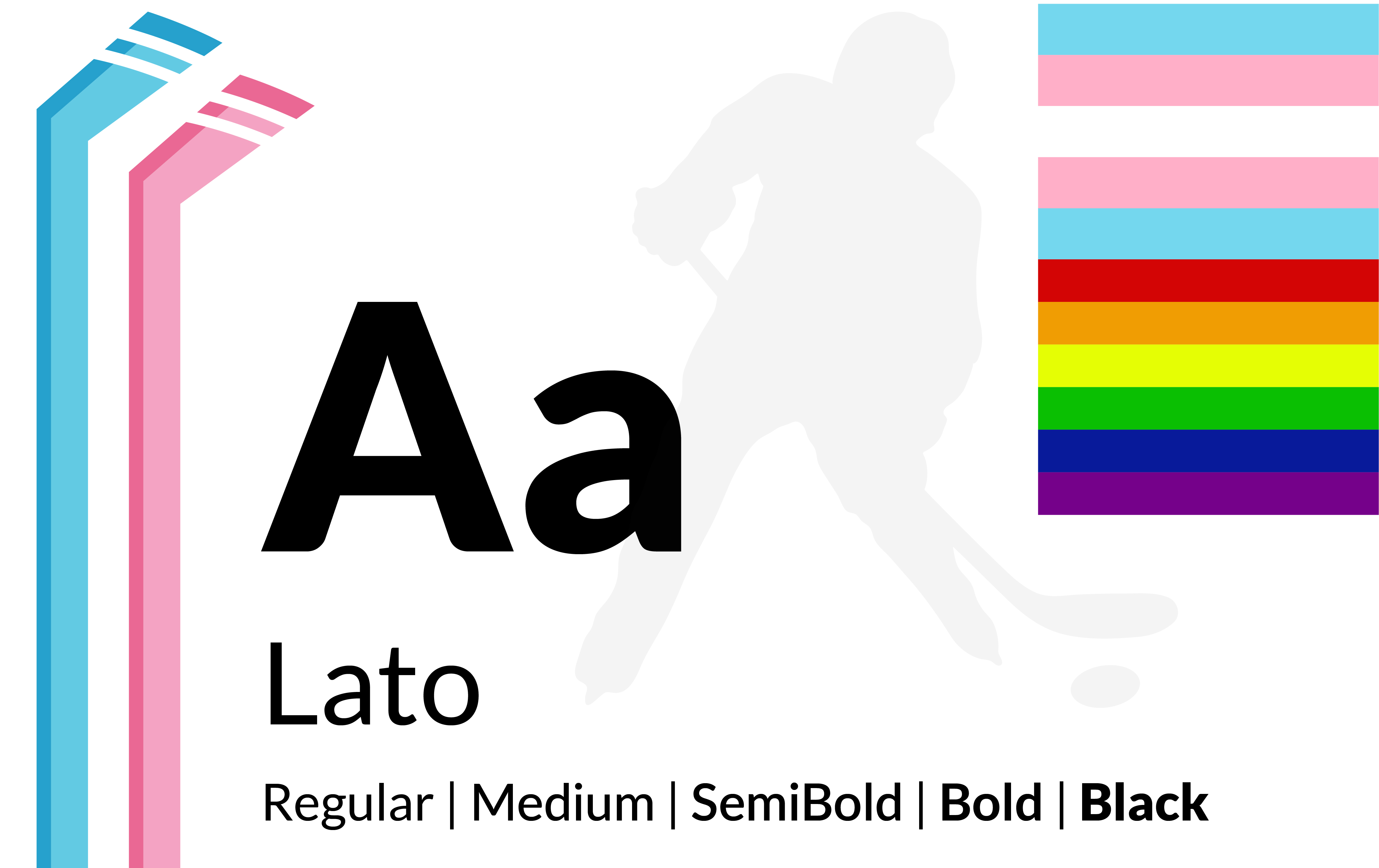
The logo uses an altered version of the font Lato, as do the general tournament graphics. The themes present throughout the imagery used are a mixture of Ottawa imagery, pride imagery, hockey imagery, and otters!
Branding beyond the weekend
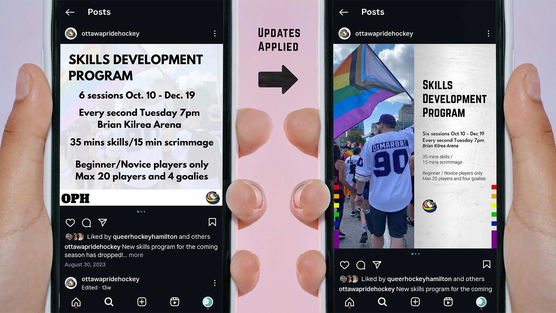
After the success of the tournament weekend, I was approached for additional assets, this time to provide social media templates for the organisation so they could establish a more cohesive presence on their instagram page.
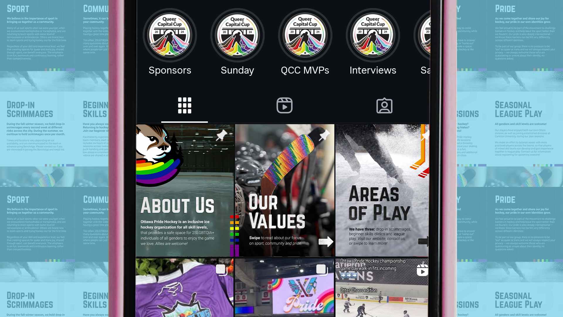
We worked together to create an array of templates for the team to use with new brand elements that hint at the team jerseys, and make use of some familiar QCC assets as well. With pinned posts and other featured post templates, they can build any post type they need for their feed.
Final Results!