City of Leduc
Municipal Website
WEB
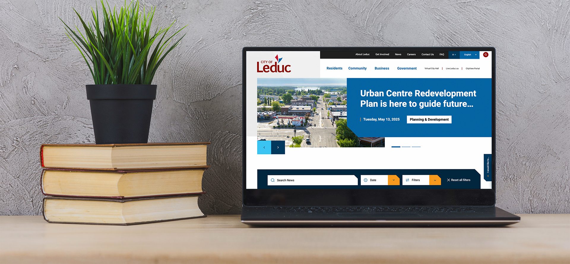
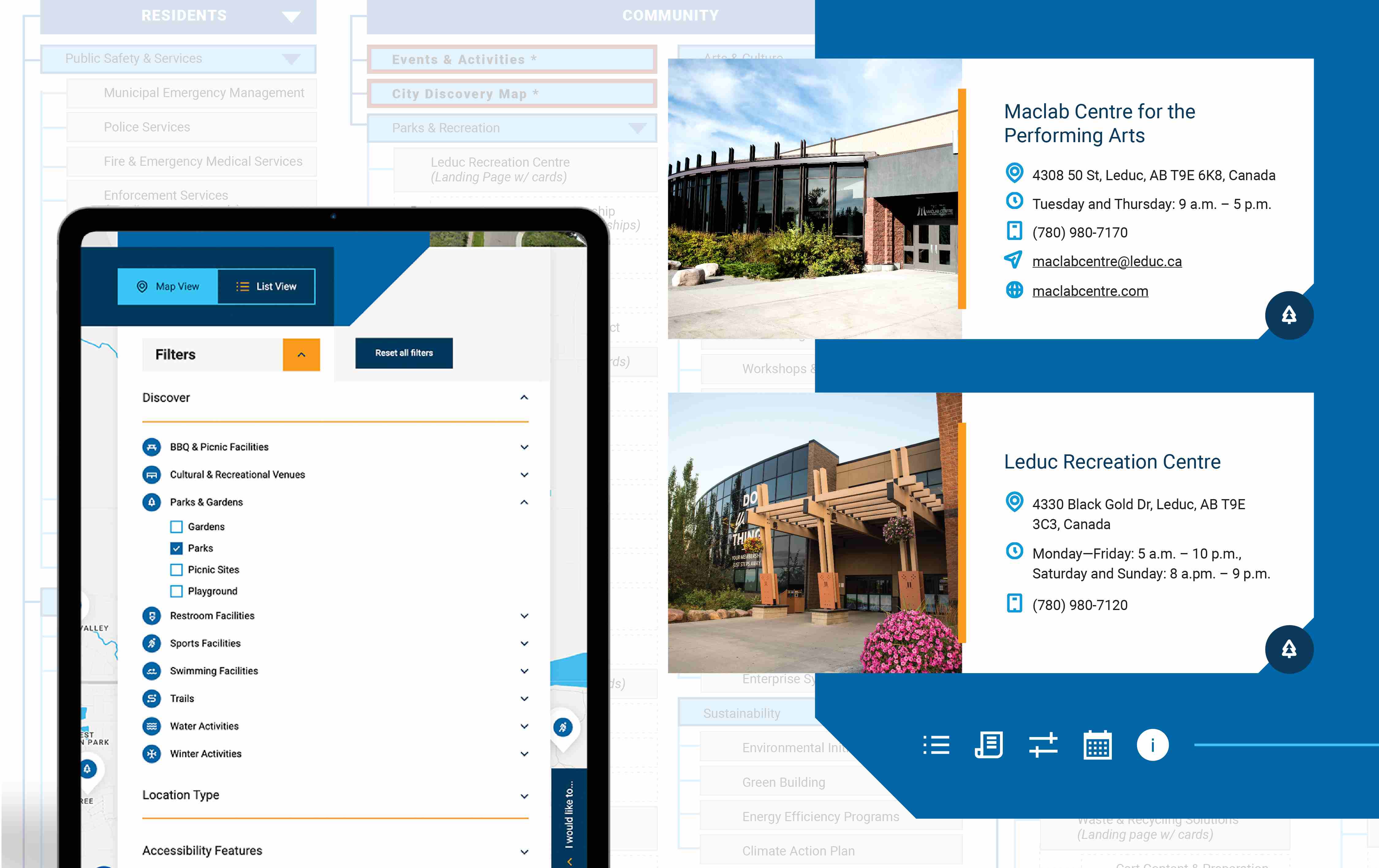
2024-2025 • As a city serving a wide range of residents, the Leduc website was dated and in need of an update to better serve its community. Their team wanted a fresh look in addition to an improved, more user-friendly experience, and new pages such as a "Discovery Map" to allow residents and visitors to make the most of the site. As part of a team bringing this large project together, I was positioned at the forefront of accomplishing the redesign they wanted.
Client:
All work done through Cinnamon Toast.
Role:
Web Design
Favourite Detail:
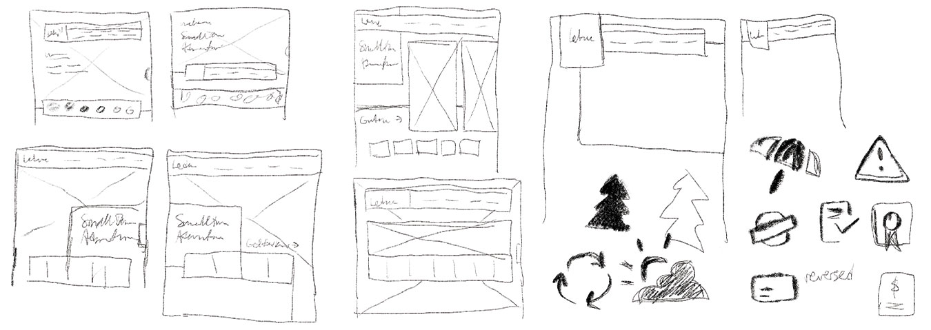
The cut corner detailing, which provided opportunity for styling cards and pages in unique, distinct ways.
Inspiration
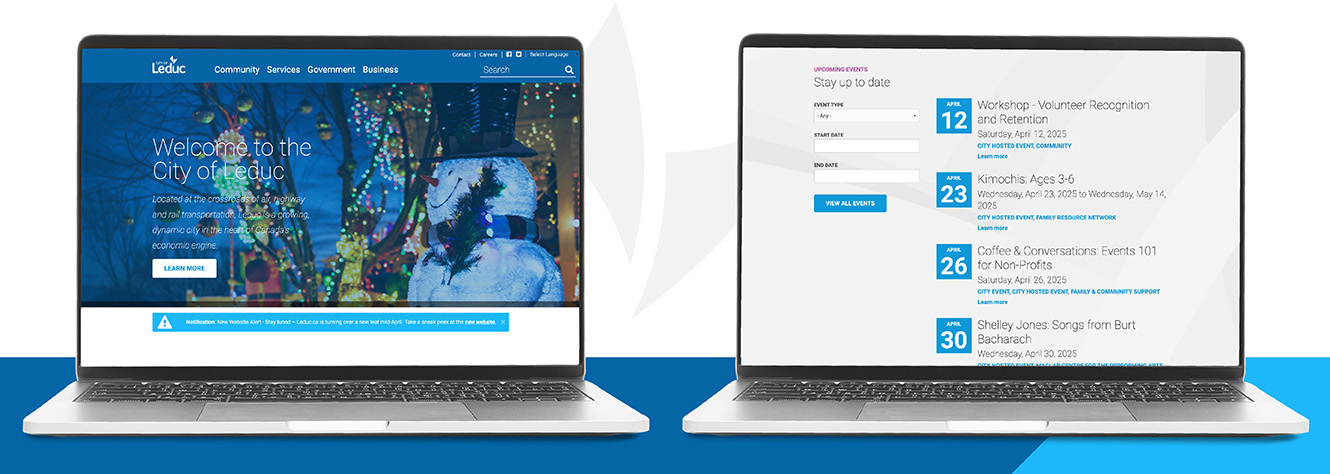
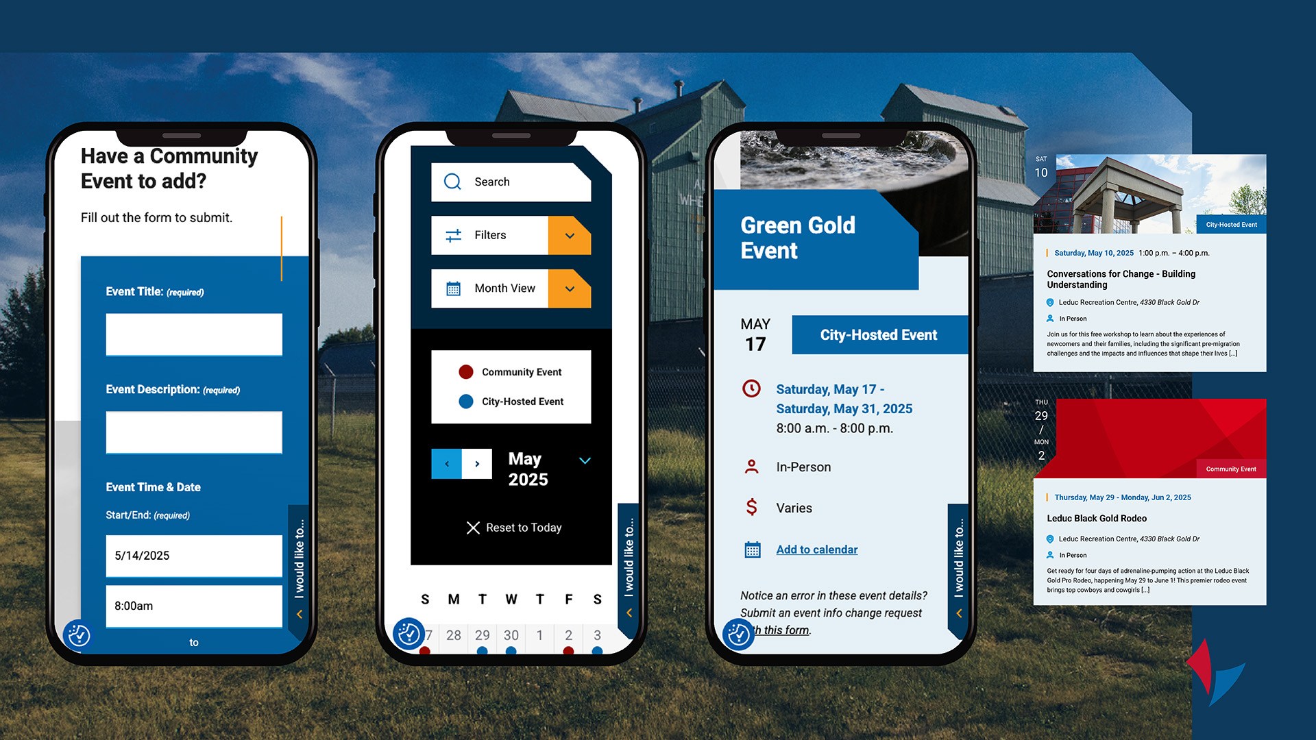
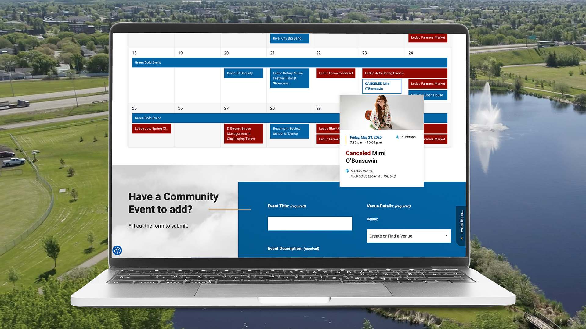
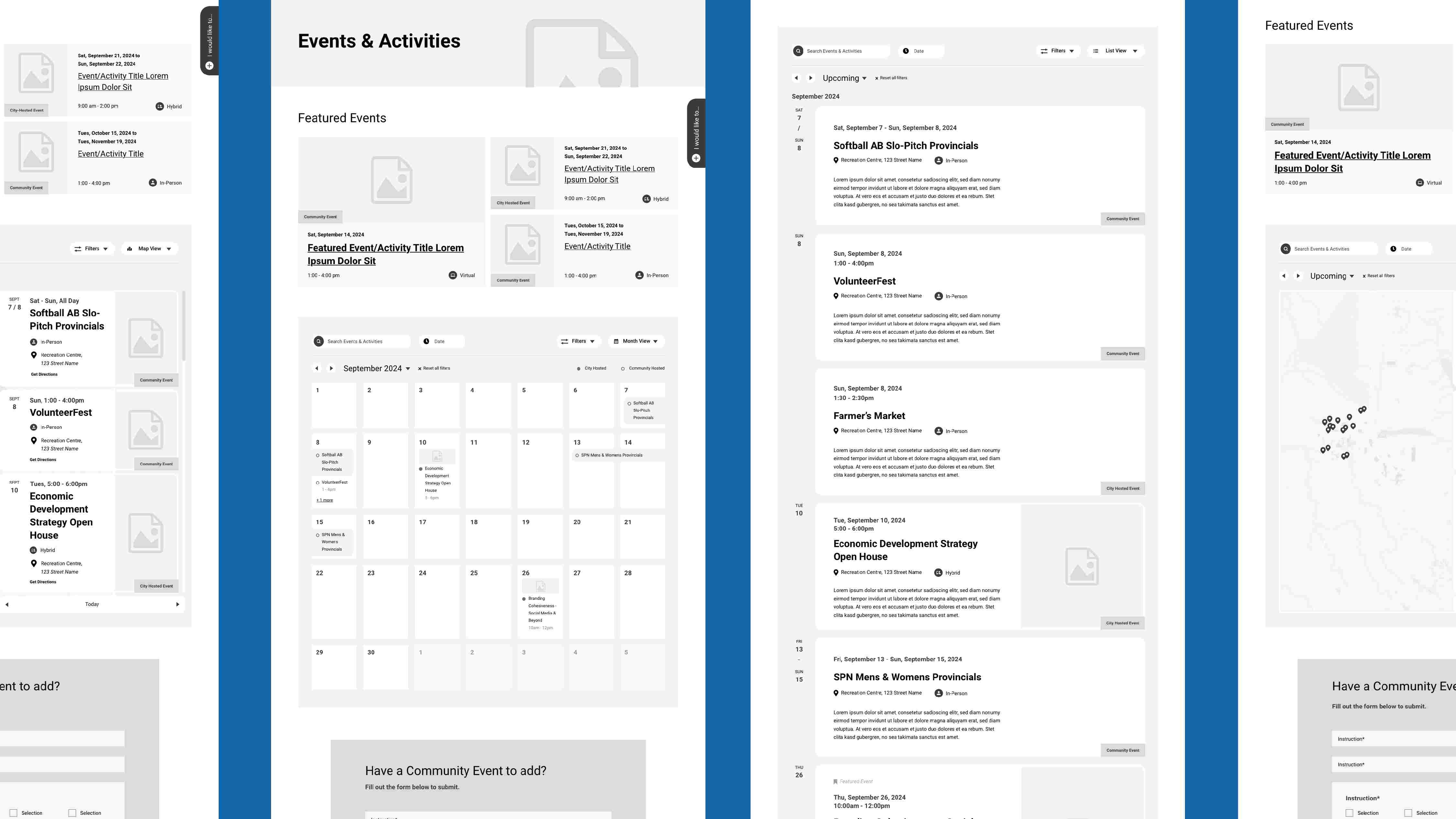
While the previous site was serving the community, there were many places improvements were possible to achieve the modern and streamlined browsing experience the City wanted. Existing pages, such as their Events calendar, were in need of enhanced accessibility and more user-friendly designs. We took their existing site and made updates so that the information residents need would still be available, but delivered in a much more impactful way.
Components
Leduc's branding is established and familiar to their web users, so many of the building blocks of the visuals came established. We added corner decoration and worked to incorporate a lot more colour than they had previously taken advantage of. This provided visual interest, accessible colour pairings, and a more distinct update against the typical blues they had previously been comfortable with.
Working as one of two designers on this project allowed for compelling moments of collaboration. I was focused on strategising, design, production and responsive builds throughout, in tandem with other pages and ideas happening. We were united in our approach from the outset and enjoyed moments of surprising sympatico when we suggested similar design elements independently. This project also provided teaching opportunities, as it was used as a real time training opportunity as our team transitioned to using a new design software.
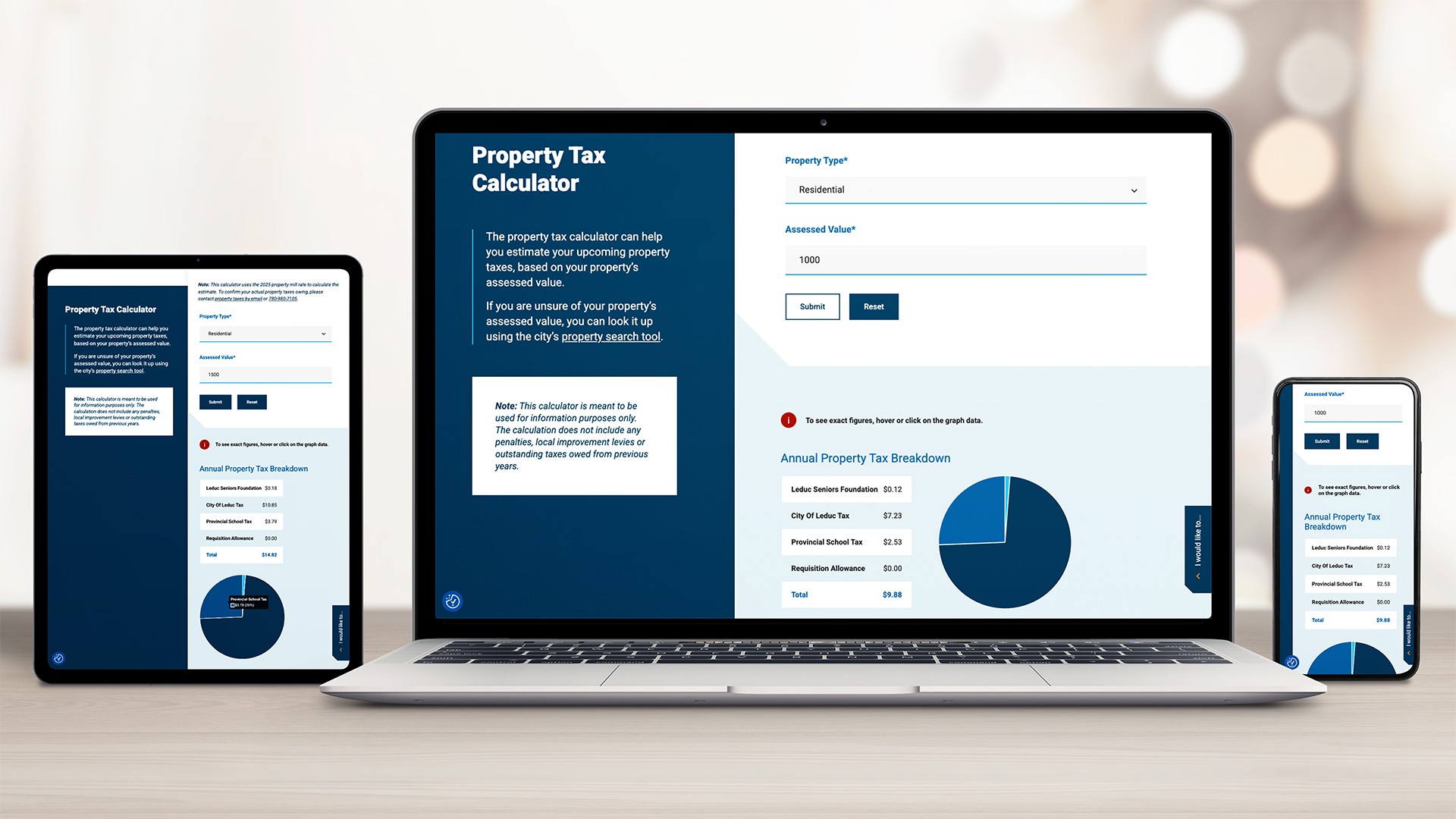
From Wireframes to Finished Design
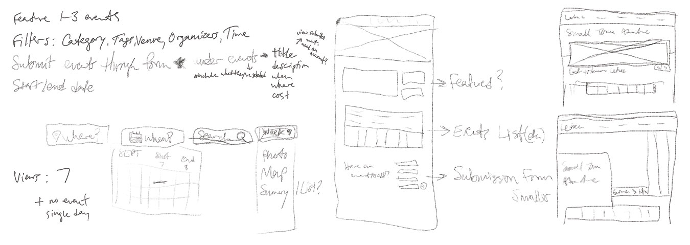
For a website serving so many different needs and with so much content, there was a lot of strategising that had to happen at the beginning of the project before any designs could be considered.
Specifically, some of the custom pages required multiple different view options that all needed to be considered before going to dev. With the attention to these details given early on, we were able to provide various views for users based on their individual preferences, and a much more enjoyable experience navigating the site.
Final Results!