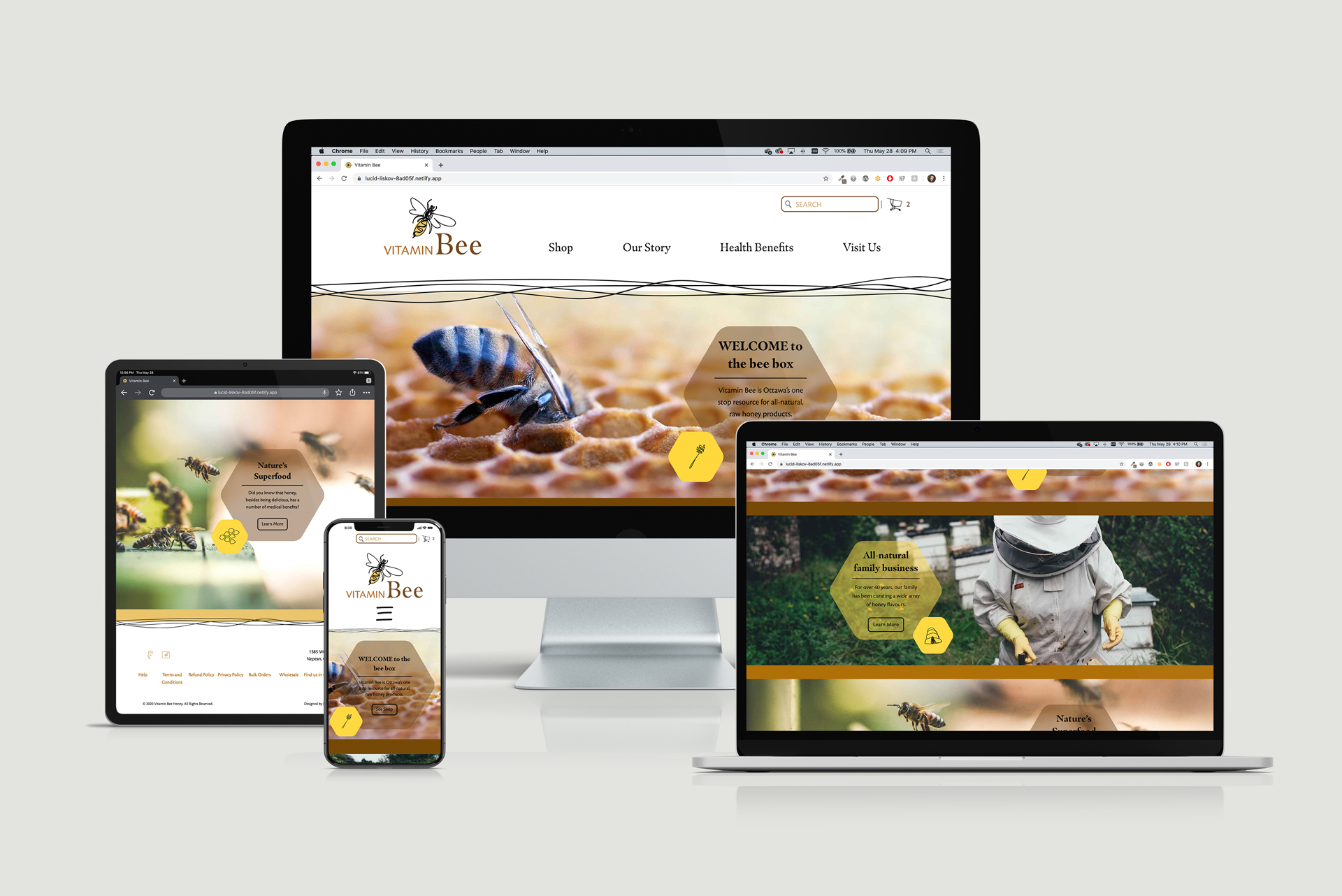
Vitamin Bee
E-commerce Site
WEB
UX/UI
BRANDING
As a project in my web development class, I was tasked with designing and building an e-commerce site selling whatever I wished to. I invented a honey business because I was interested in the style of branding I could create to accompany it.
Client:
Vitamin Bee Honey
Goal:
Develop a branded style for the company and site, as well as a pattern library for the client to pull assets from. The designs should retain a whimsical vibe but be easy to navigate for users of various ages.
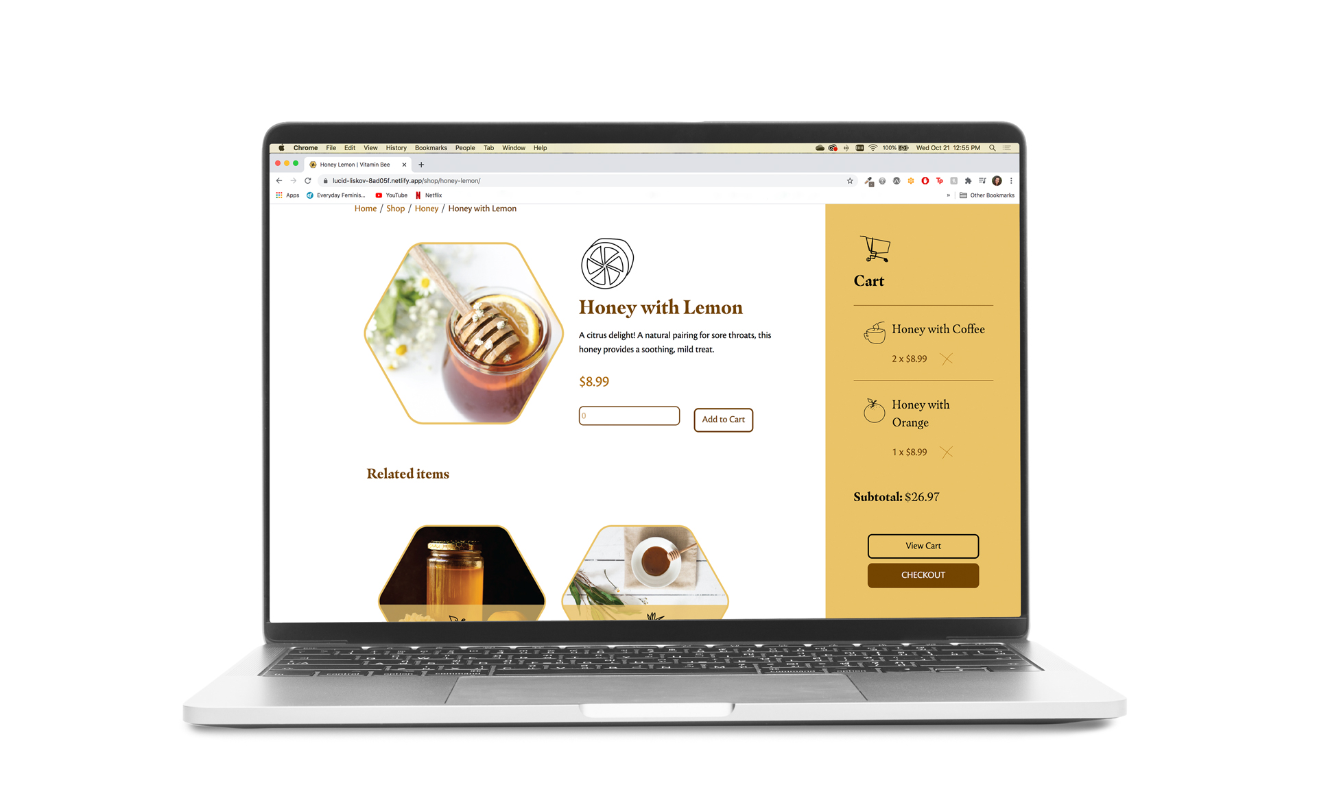
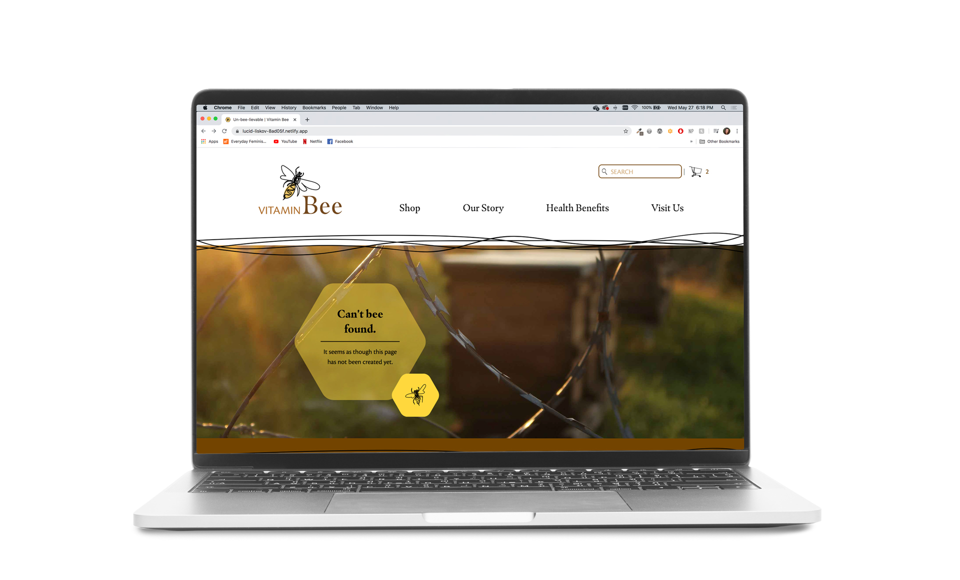
Website:
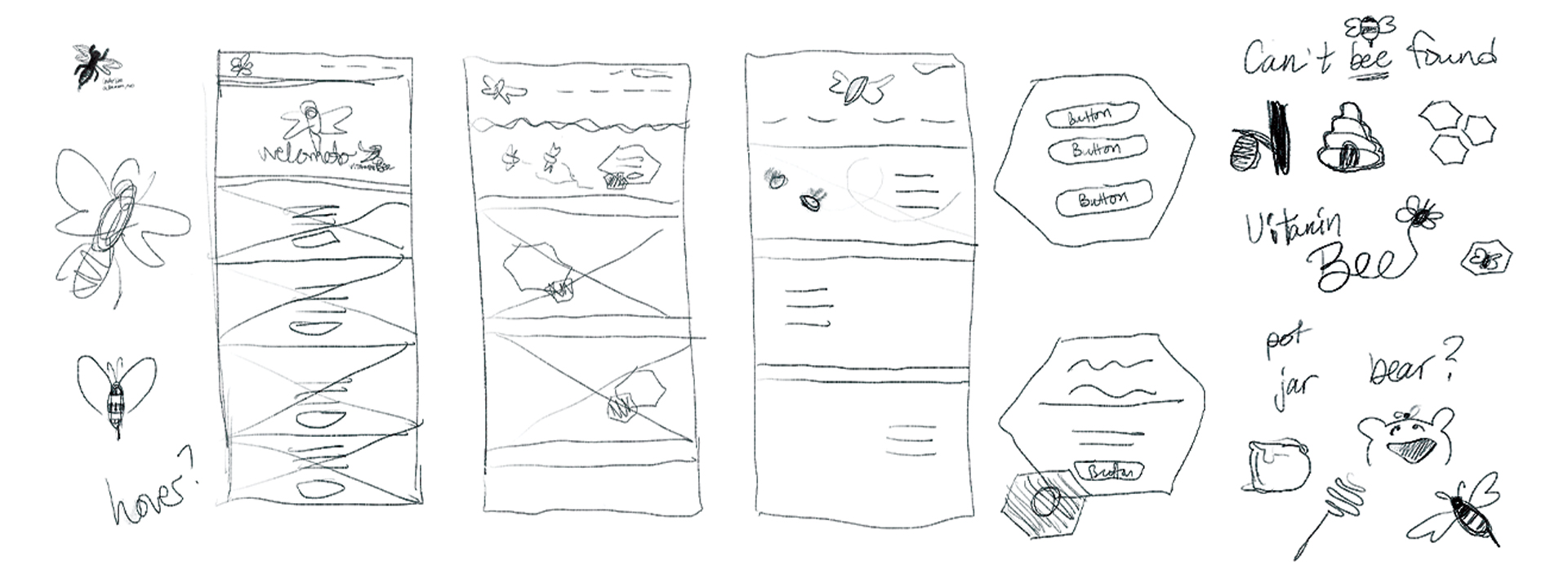
Inspiration
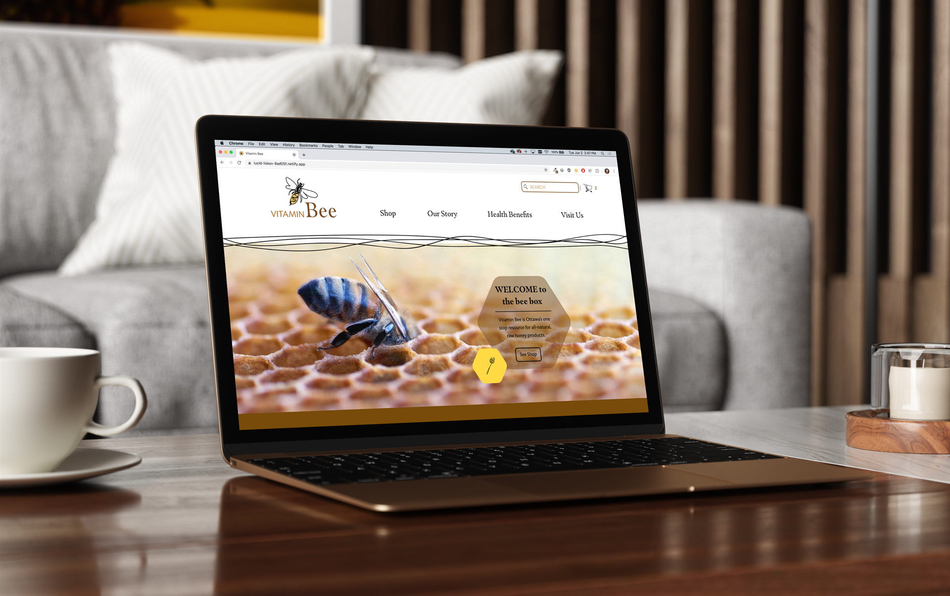
When researching the market for websites like this one, I noticed a lot of soft colour palettes and quirky, light-hearted artwork. I decided to emulate these styles by using a mixture of quality photographs and illustrations, which will allow the whimsical elements to feature but also to keep focus on the main attraction, the bees themselves. Also, SO MANY bee puns.
Components

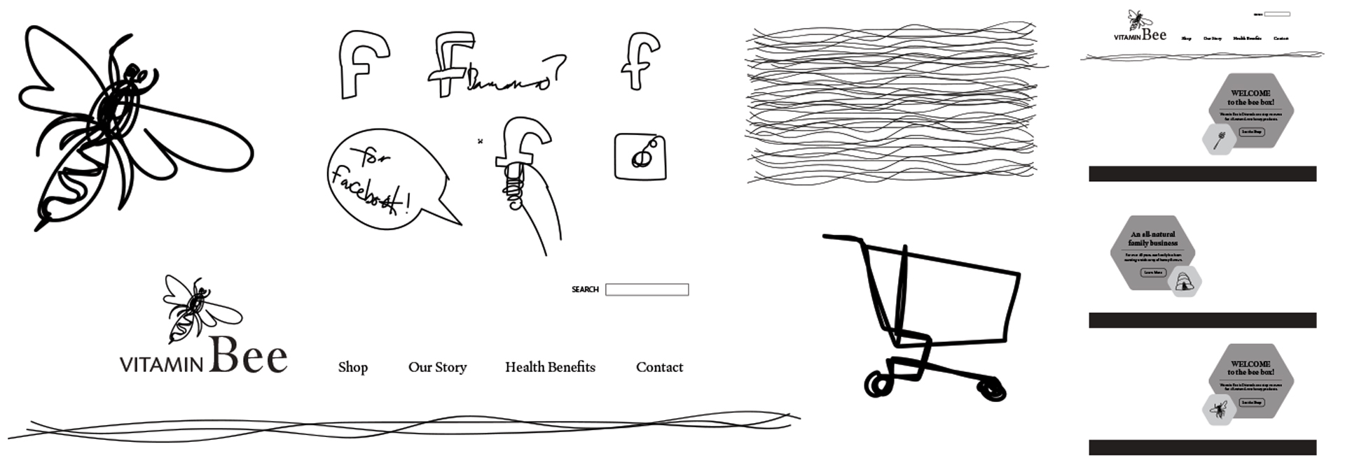
Masquarelo invokes a homegrown, whimsical vibe to the design, while Cronos provides a solid sans-serif for buttons and basic product descriptions, so the design is clean and functional. The natural, earthy browns imply the colour of honey while complimenting the theme of healthy, holistic products.

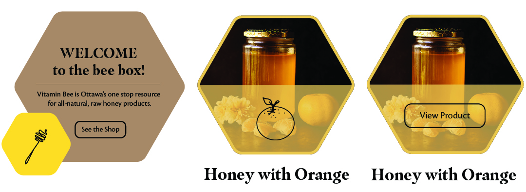
I thought it would be fun for each product to have an individual icon. As it is a family run business, I knew this goal would be achievable as the scope of products will likely expand slowly, if at all. A store that is producing hundreds or thousands of different products would not be suitable for such a component. It was fun to be able to include it!
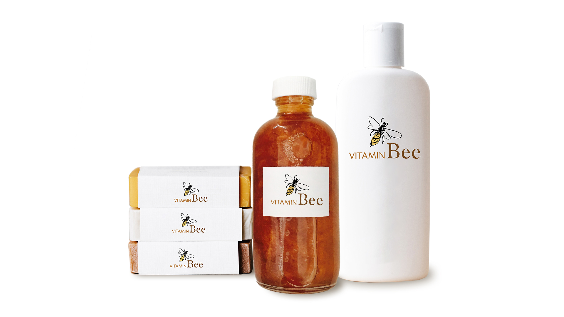
Brand Design
The Vitamin Bee logo is simple, meant to clearly depict the product being sold. This hand-drawn bee was originally just a placeholder, but I found that I wasn’t interested in changing it as I built more elements around it. This unconventional method of creating the logo was a surprise, and became the main inspiration for the rest of the site design turning towards this fast draw style.
Final Results!