Camp Fortune Skiing Campaign
Season Pass Campaign for a Ski Resort
ADVERTISING
ILLUSTRATION
MOTION
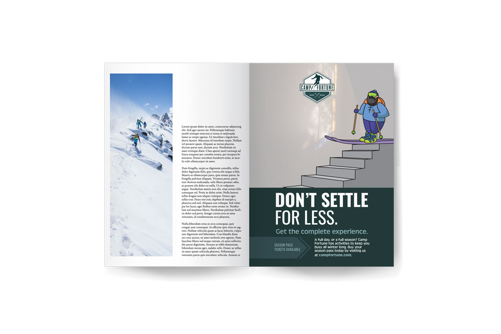
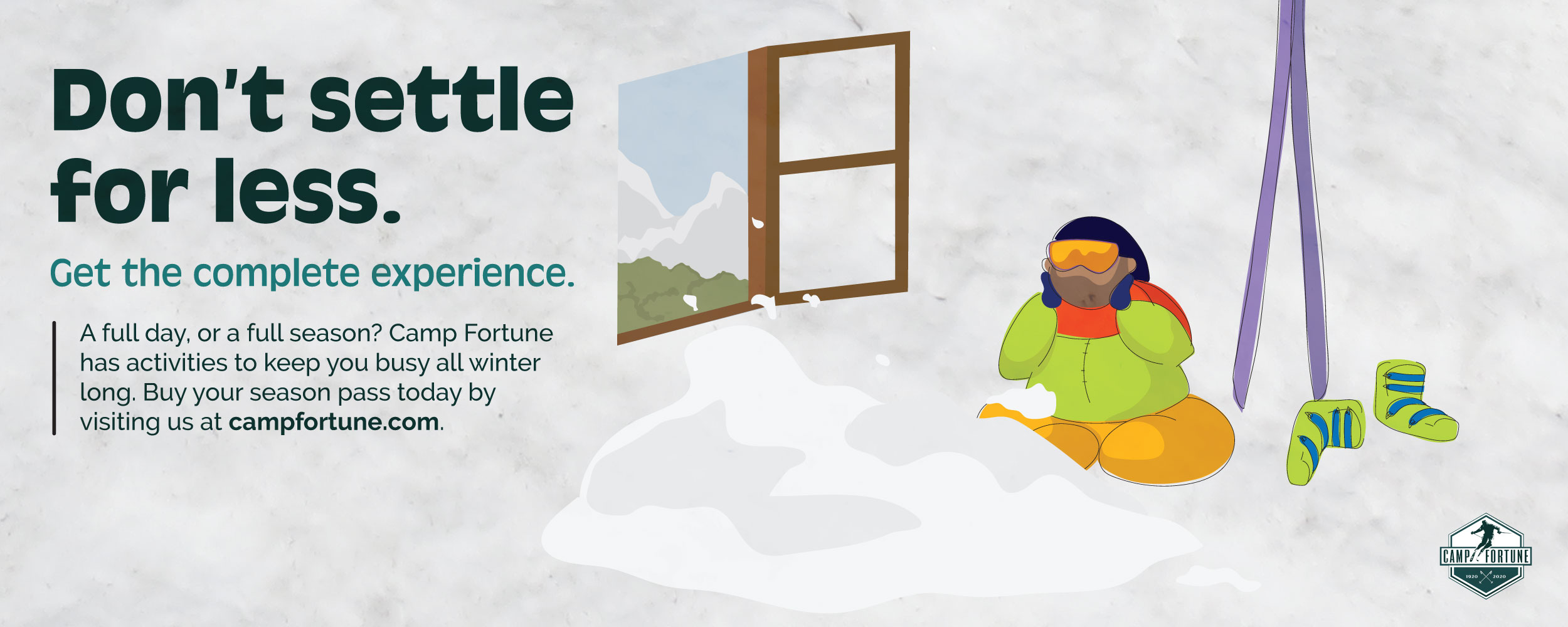
An advertising campaign to sell Season Passes at the ski resort Camp Fortune in Chelsea, QC. Using humour and brightly coloured illustrations, this campaign is targeted to catch the attention of skiing enthusiasts who might need incentive to make the purchase for a full season.
Client:
Camp Fortune
Goal:
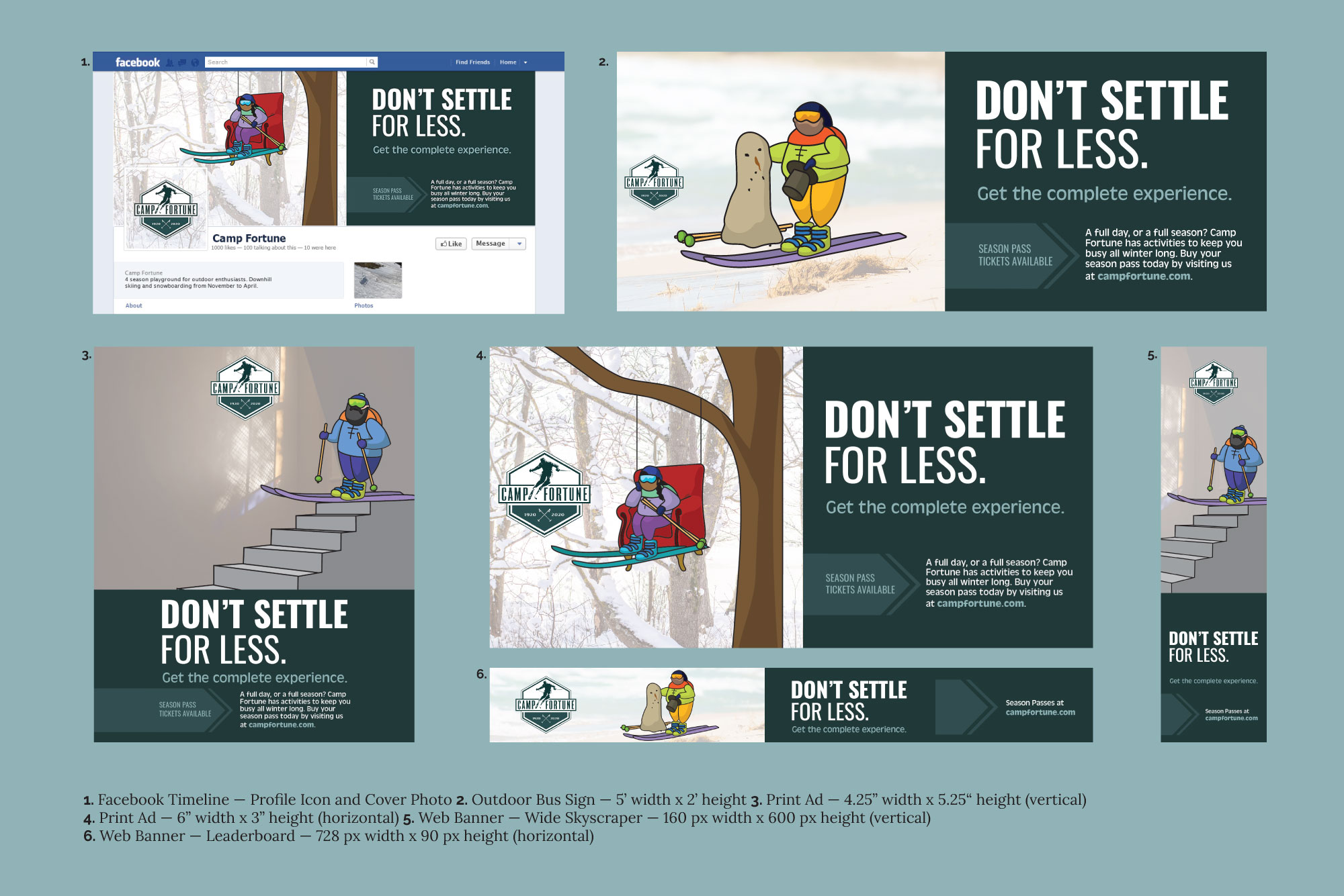
Create a campaign design that will cover various advertising opportunities (print, web) and attract viewers to purchase a Season Pass at Camp Fortune.
Favourite Detail:
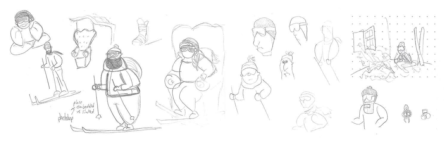
Character art style of the ill-fated skiers.
Inspiration
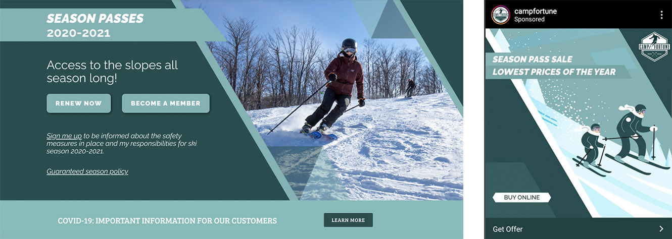
Camp Fortune has steady business through advertising to skiiers in the surrounding areas, in particular to Ottawa residents, as their hills are a short drive outside of the city. They run ads to sell Season Passes each year, with a mix of illustrative and photo-based imagery, plus direct messaging on the offer. Using these same techniques while adding an element of humour will encourage further attention and appreciation from viewers.
Components

Oswald commands attention as a strong sans-serif option, while Antique Olive is a softer counterpoint to provide details. The colour swatches are in use currently by the client so an obvious choice for consistency.

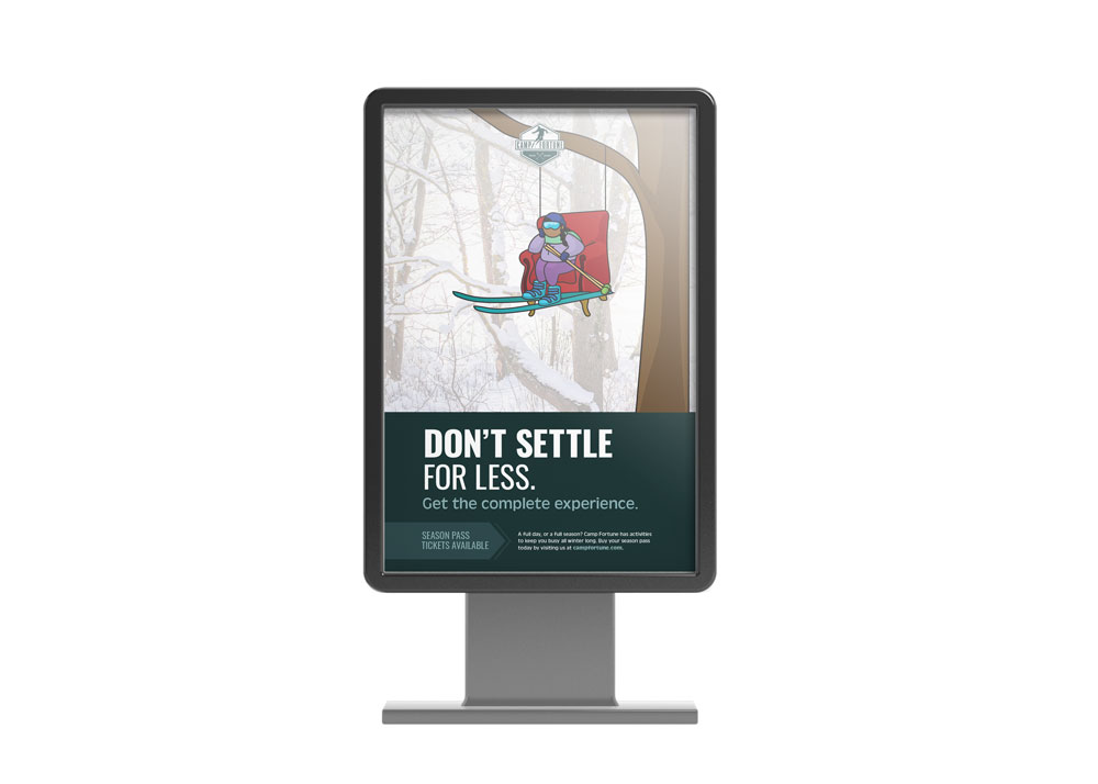
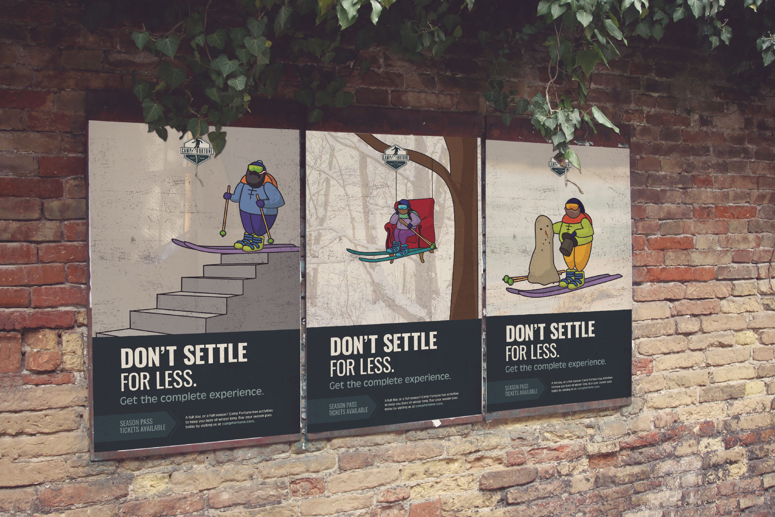
Each design features a different character that is attempting to recreate an aspect of the "ski" experience, with either disappointing or potentially dangerous results. For the moving poster additions, the design transitions into the true version of each character's attempt.
Project Update
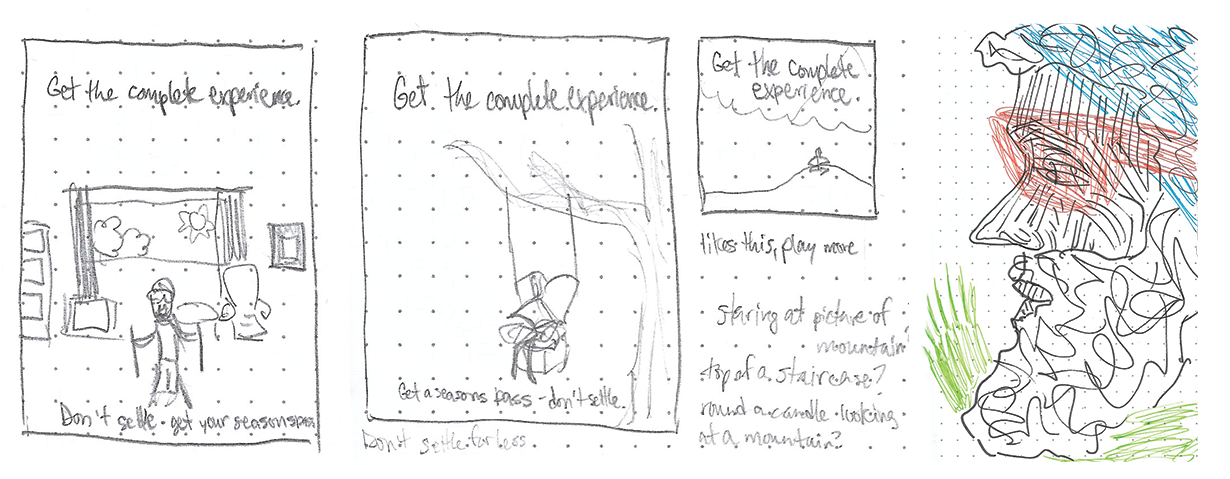
When I first tackled this project, I had the idea and slogan I wanted to use, and it felt fun, but something about the product I made didn't completely communicate what I wanted.

After reassessing, I was able to strengthen the illustrations and communicate the messaging in a way that gets the point across with less energy from the viewer, while being more visually aligned with previous communications the client had used. I was also able to add a motion element to the poster sizes, to really grab more attention. It came out stronger in the end and I'm pleased I had the chance to catch those issues and rework them.
Final Results!